Collabaplan
Collabaplan is a travel app for planning group trips, and it gives everyone an equal say in what to do while on vacation. Every member of your Trip can add to your destination’s plan, and everyone votes yay or nay; the most popular choices form the itinerary.
TRAVEL
UX/UI CASE STUDY
THREE WEEKS
SOLO
Families and groups of friends go through an extraordinary amount of research and communicate through many apps in order to plan a vacation together, and this difficulty grows exponentially as the number of travelers increases.
The solution is to merge communication, research, and planning all into a single mobile application, streamlining the entire process and eliminating many loose ends.
You can view this entire project in a zoomable whiteboard.

Research
How do families and groups of friends plan affordable vacations together?
First, my partner and I created three proto-personas to represent different families and family members who are planning a vacation. We then laid out a detailed research plan, starting with our primary research question “How do families plan plan affordable vacations together?” (in red), followed by three research objectives (in orange), and then individual interview and survey questions (in yellow) that we believed would provide the most pertinent information for our case study.

Survey
We created a 14-question survey to help us gain a better understanding of family vacation planning habits and experiences.
The largest segment of users spends six months or more planning their family vacations.
The top three family vacation destinations are amusement parks, the outdoors and national parks, and historical landmarks.
Besides COVID-19’s travel restrictions that were in place during this case study, the biggest barrier that keeps families from traveling is work.
Interviews
During our research, we conducted a total of six one-on-one interviews (each interview was scripted and recorded), as well as a survey consisting of 14 check box and short answer questions.
We arranged our data from the interviews into an affinity map, categorized the individual data points, and explored our survey data through charts and graphs.

Definition
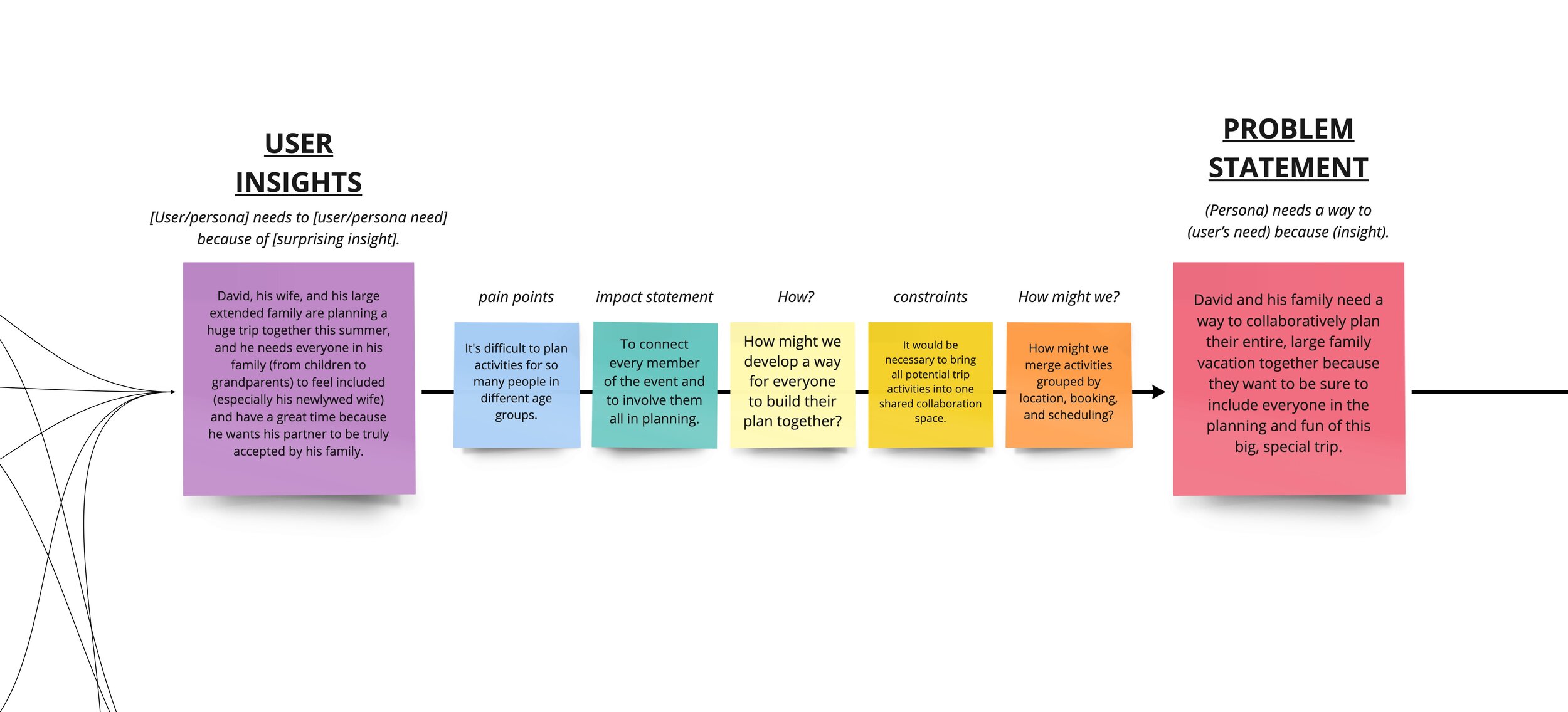
From what I had gathered from our research, I developed three separate personas for three separate families, all in different stages and situations in life, and for each of these personas, a user insight and a problem statement.
I compared and contrasted these personas, insights, and problem statements, and moved forward in the design thinking process with the problem statement that was most supported by our research.

User Insight
David, his wife, and his large extended family are planning a huge trip together this summer, and he needs everyone in his family (from children to grandparents) to feel included (especially his newlywed wife) and have a great time because he wants his partner to be truly accepted by his family.
Problem Statement
David and his family need a way to collaboratively plan their entire, large family vacation together because they want to be sure to include everyone in the planning and fun of this big, special trip.
Ideation
Feature Prioritization
Ideation began with a quick brainstorming exercise - a mind map. After that, I expanded upon my first thoughts into data points of likes, wants, and wishes, which were then categorized into groups of similar wants and needs. I selected the ten most important features and arranged them into a feature prioritization matrix. Planning together and collectively voting on activities were seen as the most crucial features to develop.
These features were balanced with the needs and wants of our target users in a Value Proposition Canvas. This user was further defined by creating a detailed user scenario and storyboard for the concept, along with a comprehensive user journey map.
Task Flow
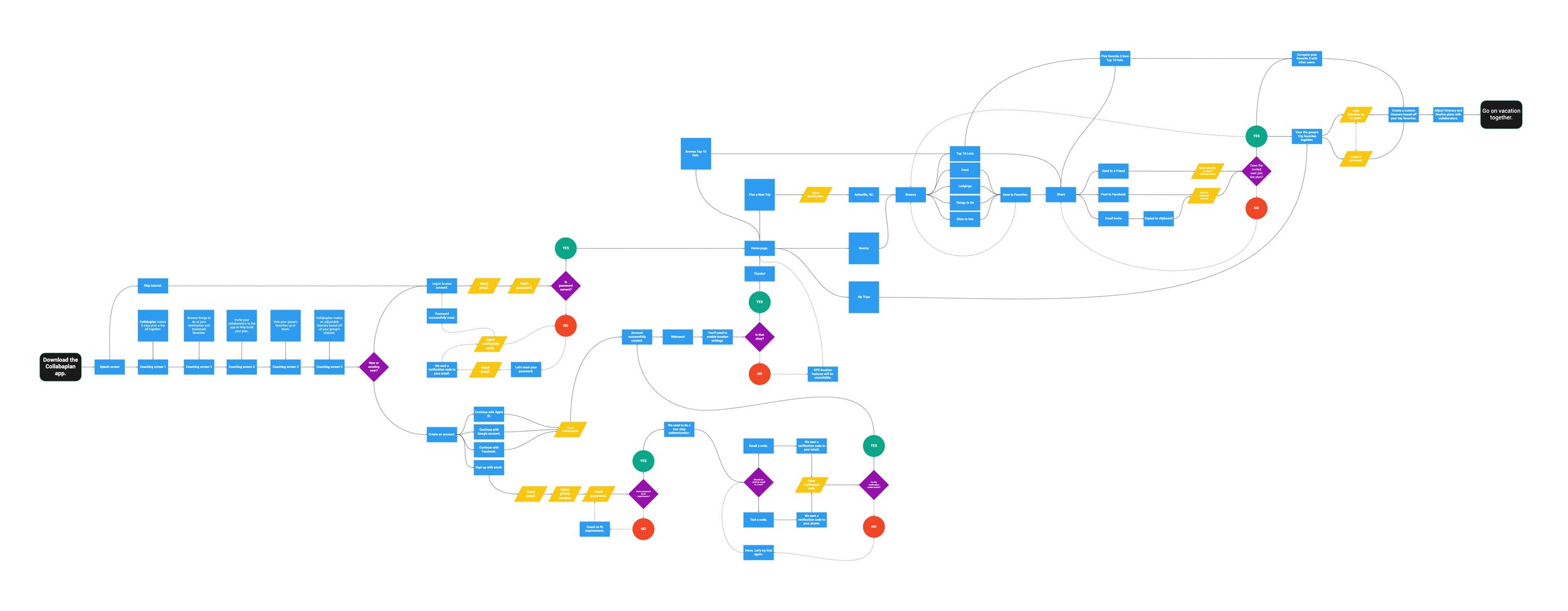
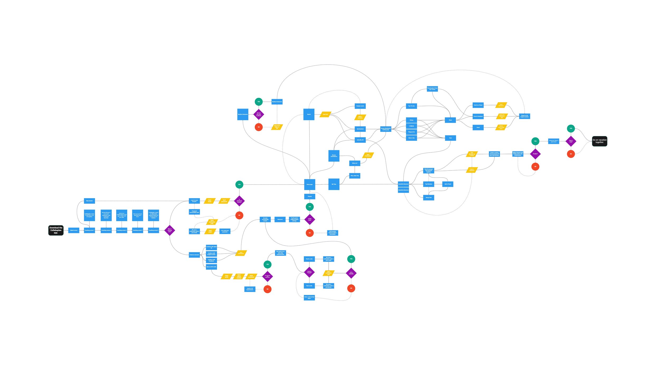
The task flow and user flow were developed to define the experience of a user who planning a vacation by using the app. Below, the task flow depicts a user moving through the planning process, with different stages of this journey in different colors.

User Flow
Each step in the user flow represents a screen or function in the application and the decisions and inputs of the user. Screens and functions are in blue; inputs from the user are in yellow; and user decisions are in purple, with YES in green and NO in red.
It’s important to note than many parts of both the task flow and user flow are cyclic, such as browsing a list of attractions, saving and sharing one, and then repeating those processes.
Prototyping
Wireframes
For me, the beginning of any idea starts with sketching on paper with pens, pencils, and markers. I find it the most natural way to develop a concept, so I laid out every screen in the first prototype in this fashion, and each was scanned and added to my Miro board for the project.

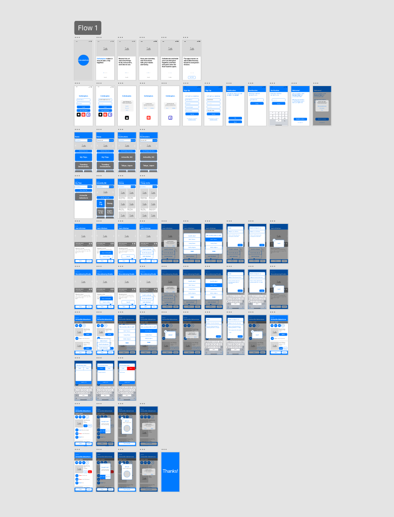
Once digitized, I made quick work of a low-fidelity prototype in Adobe XD. Next, I introduced a single color and further developed the UI, and then linked each screen into a clickable prototype.

Prototype v1.0 (above)
Prototype v2.0 (right and below)
I continued to develop this V1 prototype, adding screens and refining the UI, until it had almost tripled in size and truly became V2, the version that I user tested.
User Testing
Mid-Fidelity Testing
Now that I was happy with the prototype’s functionality (albeit only momentarily), I created a user testing plan of six simple tasks to judge the usability of the mobile app.
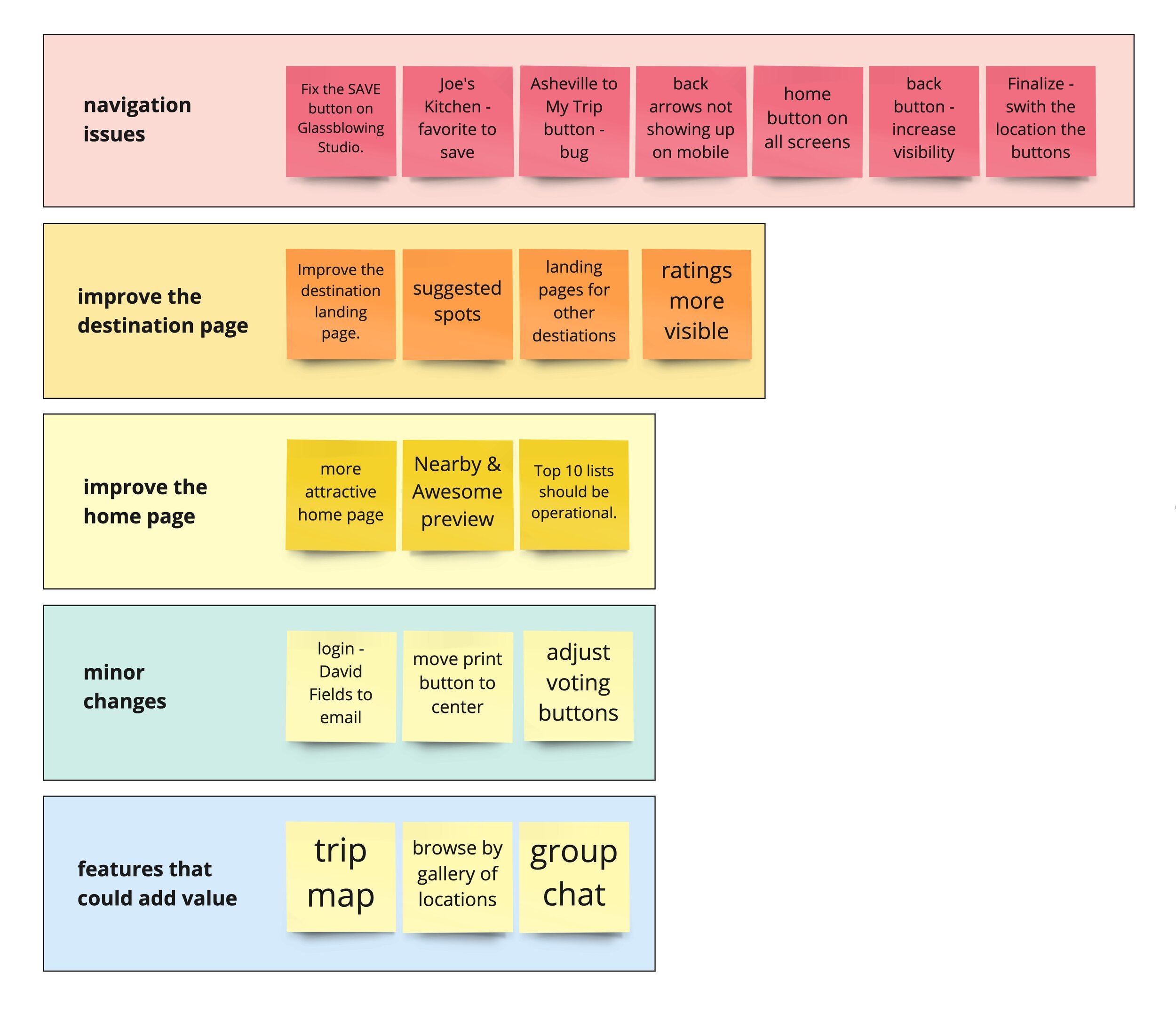
The average score for the five participants was an A (90.0%), but there were a few consistent issues with the interface’s navigation.
Any issues of note were transposed to single sticky notes on the Miro board. In much the same way as the features, I prioritized the problems with a matrix, and focused upon those that were most important for V3.
The user flow was modified to accommodate those issues. The most extensive revisions were to the search and discovery functions.
Future Plans
From interviews with those presented with the concept, most users expressed a liking to the idea,, and that this concept could be a very useful tool for any group that is planning an out-of-town trip.
I addressed all of the prioritized problems that I found during testing. I continued to refine the prototype’s interface, appearance, imagery, and functionality, until I felt that it had grown properly to V3, which you can test with the PROTOTYPE button below.
In the future, I would love expand this high-fidelity prototype into a fully functional iOS app, as I believe that it fills a great niche in the travel app department.


