Legato
Legato is a social networking app built around music and designed to form new connections between musicians.
Meet new musicians to jam and collaborate with, in your city or anywhere in the world.
Stay connected with artists and musician interest groups in the tabular My Band interface.
Discover new music from independent artists and learn about the musicians.
MUSIC COLLABORATION
UX/UI CASE STUDY
FIVE WEEKS
TEAM

The Profile
I sought to create a profile that is compelling, encapsulating; something that tells a story about who someone is as a musician.
The focus is on the user’s music: music that they have made, what instruments they plays, and what style they like to play. You can view and listen to recordings and songs that the user has uploaded to their profile. Users can also post pictures of their gear and share in discussions on equipment. You can even read about where the user’s inspiration comes from and check out their favorite albums.
It’s easy to interact with a fellow musician once you’ve checked out their profile. You can send them a direct message and ask to collaborate, or just let them know that you love their music by liking their profile or tracks. Think they might be a good addition to your Band? Just share the profile to one of your connections.

The Home Screen
The Home screen presents the most pertinent information to the user first. At the top of the Home screen, users can view story posts from users that they follow, and right below that is the News Feed: important updates from the user’s favorite artists.
The daily artist spotlight is next, which features a short article on a top artist on Legato and some of their music. Next, the user will find nearby musicians within a certain radius and scroll horizontally to view the results. The Top Tracks is the daily list of the most listened to songs from Legato users.
Finally, we come to the top live stream broadcast. Any user can tune into broadcasts, and they can reply with emojis or a DM. Upon reaching the bottom of the Home page, the My Band section begins, redirecting the user.

My Band
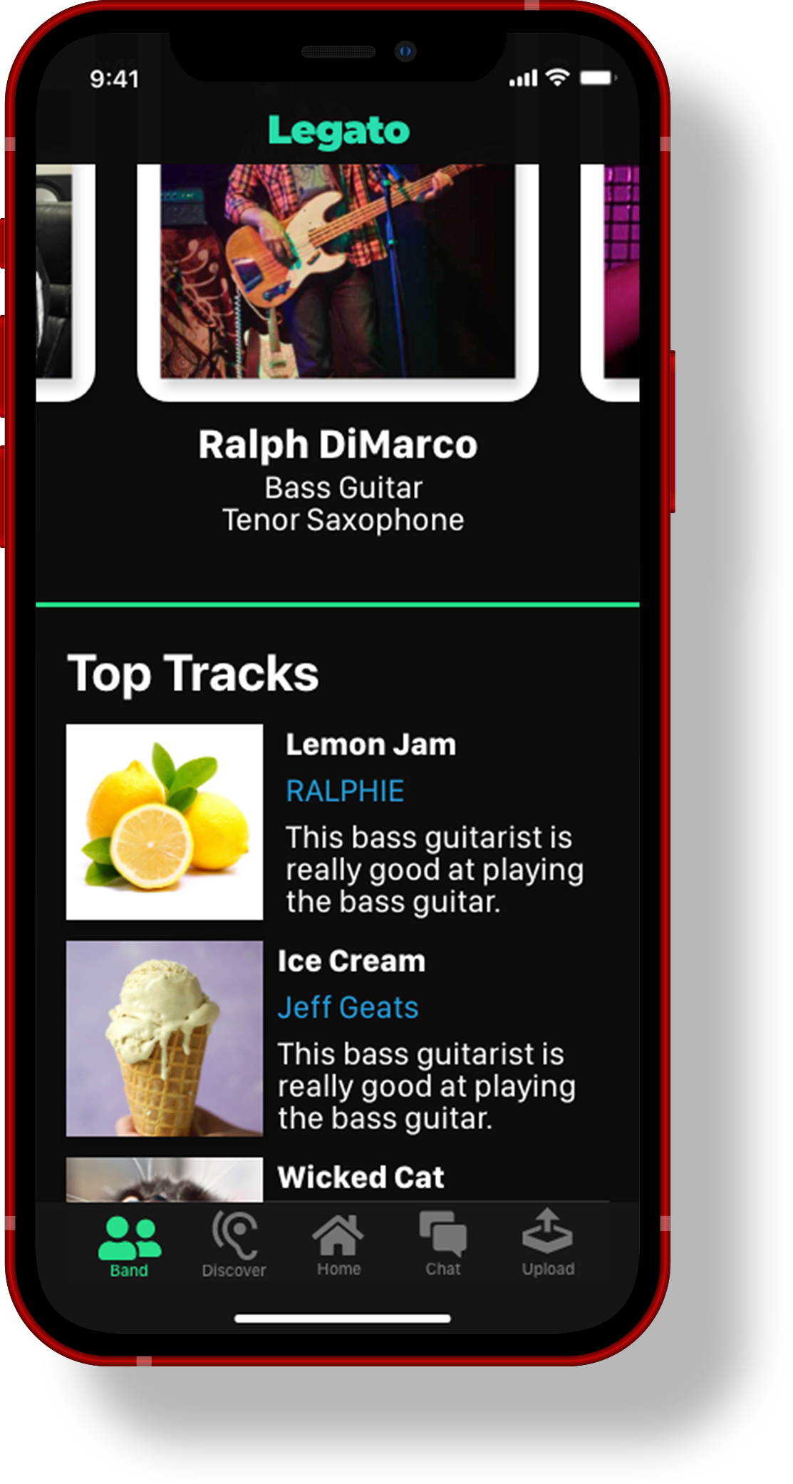
My Band is a unique tabular interface that condenses and organizes different posts from followed users, groups, interests, and hash tags.
Tabs can be expanded and collapsed independently, and the user can arrange the tabs in whatever order they see fit, or with the presets for most recently updated and alphabetic order.
Within the tabs, posts of songs, videos, and pictures can be posted, and other users can like these posts or leave a comment.

You can view this entire project in a zoomable whiteboard.

Research
We started with developing a proto-persona and an online questionnaire to gain some quantitative data about our potential users. This survey was distributed on social media, primarily Reddit. We conducted one-on-one interviews with musicians that we personally knew, and organized our interview notes in an affinity map. Following interviews, we created a detailed and comprehensive competitor analysis.
Survey
We posted a Google Forms survey on social media platforms Facebook and Reddit, we each sent it out to all of our own personal networks. We had responses from all regions of the United States, as well as one response from Norway.
Of the musicians that we surveyed:
The majority of musicians prefer to play as part of a group, or would if they could.
Pianos and MIDI controllers are the most popular instruments.
87.5% are under the age of 40.
44% have collaborated online.
33% have performed on a live stream on social media.
25% perform in a group.
Interviews
We spoke with five musicians, one-on-one, to really get a grasp on their musical process, their collaborations and how they felt about those, and what music really means to them.
All musicians share a deep passion for music.
This is the one element in our research that was true for 100% of the sample. Every single person we talked to had a great love of music - in playing music just as well as listening to and experiencing new music. Several interview subjects worked part-time jobs in fields that had nothing to do with their goals or passions, but they were thrilled each day to come home and play.
Instruments, equipment, software, and methods vary greatly.
There are limitless ways to go about creating music. Responses to our survey question, “What instruments, equipment, and/or software are most essential to creating your music?” left us with more questions than answers.
Online collaborations can be difficult and undesirable.
Passion for music was very apparent across all interviews, but what influenced our direction most was the general disdain for online collaborations and the mixed bag of networking sources that musicians were turning to in order to connect with other musicians.
Means of connecting with other musicians vary greatly.
Several musicians said that they had connected with other users on Reddit, Instagram, Twitch, and other social media platforms, and to mixed results. One survey respondent, a music producer, told us that he had met many of his clients on Reddit. Due to the COVID-19 quarantine measures that were in place during this case study, meeting other musicians at an open mic night, concert, or even a retailer for musical instruments was most likely not an option.
Persona
We developed a persona to represent our theoretical user with data from our interviews, survey responses, and background research.
Jeff is almost 30, works two part-time jobs to pay the bills, and the most important thing in his life is music. He wants to make music that he is truly proud of, to create something that he can share with the world, and he spends every minute of his free time creating music and advancing his musical skills. He has a vision for a great album, but he doesn’t quite yet have the skills, instruments, and equipment to create what he has in mind, and he wishes that he knew more people that were into the music that he likes.
User Insight
Jeff needs to find quality musicians to collaborate with because he is unable to find anyone with similar music tastes to complement his musical skills in his current network.
Problem Statement
Jeff is unable to create the music that he wishes he could due to limited resources and an exhausted network, so he needs to find talented, trustworthy musicians to collaborate with online and an efficient collaborative process to do so.
Competitor Analysis
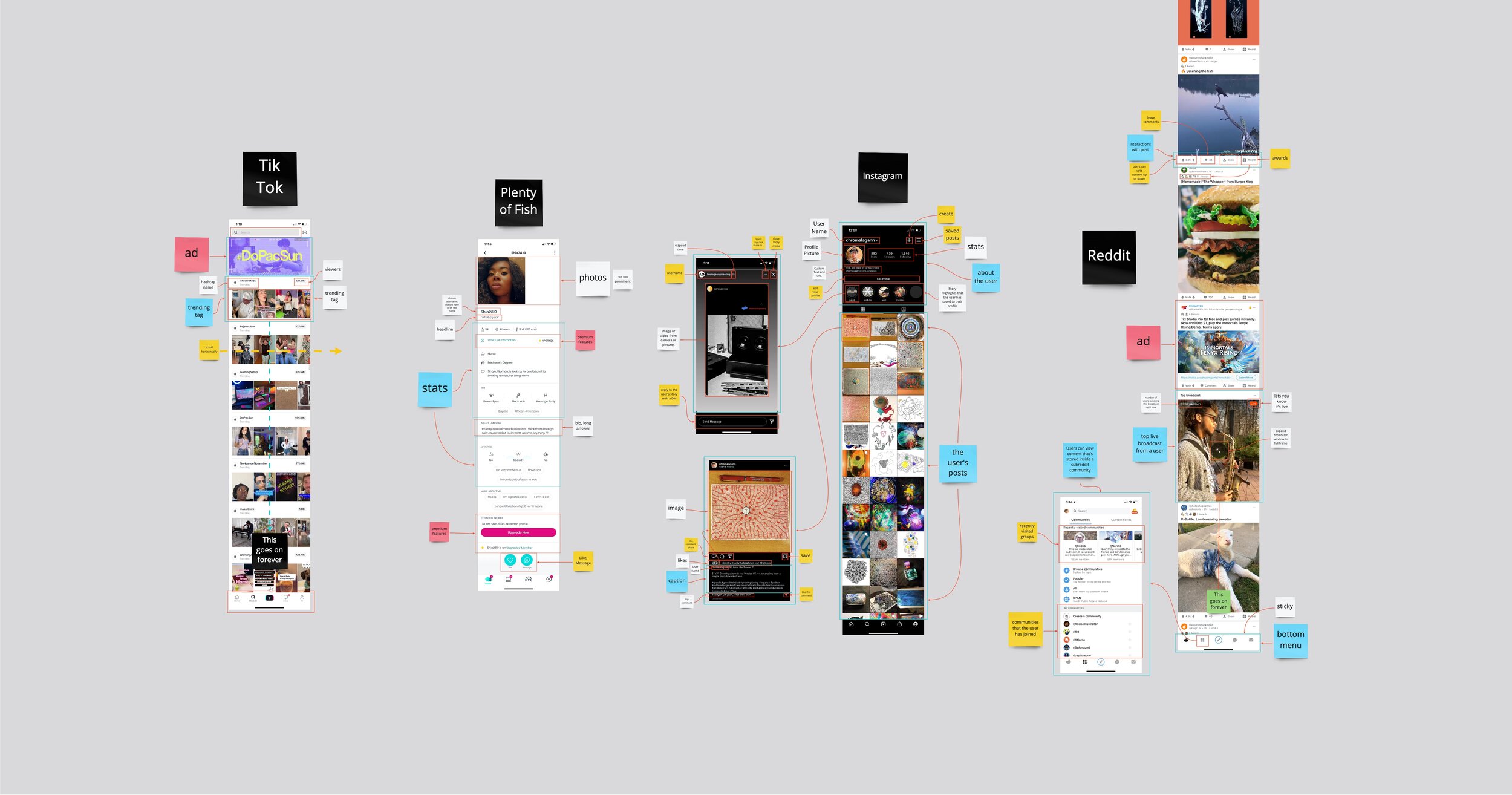
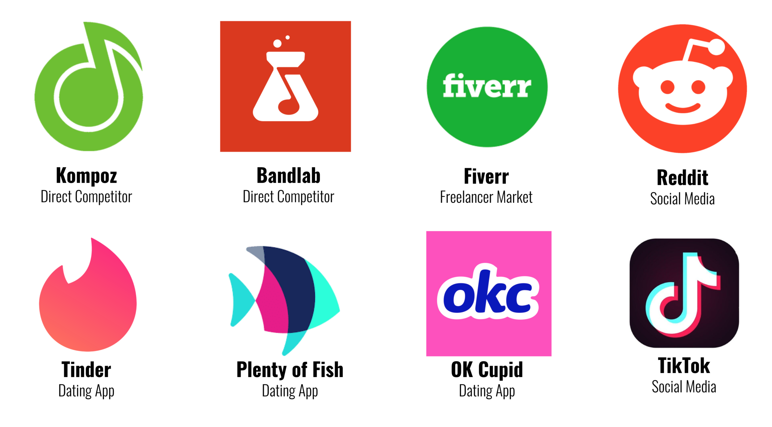
We did a very thorough competitor analysis, including more as we shifted and focused our primary objectives. The first applications that we looked at were collaborative DAWs (Digital Audio Workstations), but we moved to focus more on actually connecting musicians to one another. Dating apps and social media presented the best and worst of profiles and discovery.
Dating Applications
Dating apps present many solutions to a classic challenge: meeting new people. Any type of application that is designed to introduce people to each other must have some degree of a compatibility test. Profiles are excellent ways to determine one’s potential compatibility with another user first-hand, and then we need some way reach out to that profile holder in an attempt to make a connection.
Social Media
All social media platforms want you to spend as much time as possible using their app, and the discovery of new users and content is critical to maxing out screen time. Reddit was the most commonly mentioned social media platform in our research and we found subreddits to be a source of inspiration in the design of the My Band section of our application.

Ideation
Sketching is the most natural, most efficient way to conceptualize, to visually explore concepts and ideas, so that is where we started. Scans of our rudimentary wireframes were brought into our whiteboard in Miro for further exploration, alongside innumerable sticky notes and annotations.

User Flow
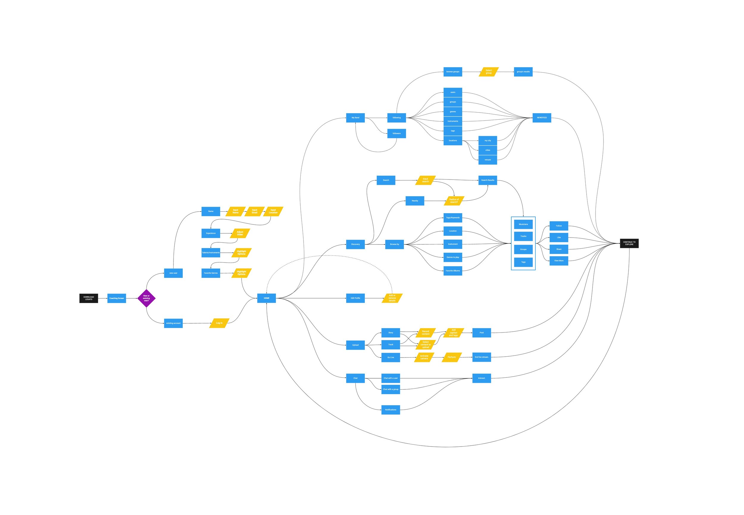
Developing a complete, efficient, and well-organized user flow was critical for a thorough understanding of the proposed application and its many functions. Interaction is centered upon the Home screen (the rightmost object after the initial onboarding). All functions flow out of and then, eventually, back into the home screen; discovery is cyclic and perpetual.
Our user flow is laid out laterally so that the viewer progress from right to left. Each function, every screen of the app, has been mapped out here in blue, and the yellow rhombuses represent a required input from the user.

Prototyping
Our first prototype was developed simultaneously with the user flow and task flow, and with several bursts of sketching wireframes in between. This initial prototype was fleshed out while mapping screens that each individual team member had created to functions of our task flow.
The model below shows the first prototype’s screens mapped to the icons of the primary navigation bar, which are in blue sticky notes. Individual tasks are represented by the yellow sticky notes, and the user’s profile is the pink one.

Mid-Fidelity Testing
Task 1: Onboarding
The user was asked to sign up for a new account using their email address.
100%
All users found the onboarding process to be simple and straightforward.
Task 2: My Band
The user was asked to find the most recent post in the Electronic group of My Band.
90%
One participant found the tabbed view of the My Band section to be rather unusual.
Task 3: Discovery
The user was asked to find music from the “Trap” genre using Discovery.
65%
All users had at least some degree of difficulty with the Discovery feature. Many complained that the back buttons were too small, and several encountered a recurring bug on saving.
Prototype 2
After our first round of user testing, we focused on addressing the navigation issues that were encountered in the Discovery tool and on streamlining our design under one ubiquitous style guide.
The model below shows every connection between all of the art boards of Prototype 2.

We wanted to create an interface that was clean, modern, friendly, and colorful. Our color scheme is primarily cool colors - green, blue, and purple - with white text over a black background. We used the sans serif typefaces SF Pro Display and SF Compact Text.
All of the elements have rounded corners (especially in My Band). This helps to create a soft, amicable interface. Skeuomorphic tabs are used to signify expansion, and can be flipped through like albums at the a record store.
Final Product
After our presentation, I continued to develop Legato on my own in a third iteration. The onboarding section and the Discovery tool were cleaned up and refined.
Future Plans
Our first priority in continuing Legato would be more user testing and refinement. We would love to bring the app to a beta test with a fully-functional interface, and eventually develop the application for deployment.
Our goal is to encourage more musician-to-musician use. A key feature for early success is the ability to connect and jam with local musicians. A concierge prototype would be a great way to launch the app in the Atlanta area.
Monetization is undecided. Affiliate marketing could be created within the Gear sections, alongside ads in the home screen and My Band section, but we don’t like the idea of sponsored posts.
“Music will save you.”
— Bailey, electronic musician, in his interview with me


