SiteOne Branch Finder
SiteOne Landscape Supply has over 600 stores in the US and Canada, but their branch finder on the mobile app was a mess and in need of a thorough revamping. I reanimated it into one of the most impressive features of the mobile app for a company whose entire digital experience changes based on the store you’re shopping.
The Desktop and Mobile Web redesign is in progress and I’ll update my portfolio once it’s been released.
FEATURE REDESIGN
MOBILE APP
Figma
FigJam
Full Story
Adobe Analytics
Usability Evaluation
Competitor Analysis
User Flows
Sketching & Wireframing
Prototyping


How do you improve an existing feature?
Talk to your users and understand their pain points. Analyze your data and identify problem areas.
Evaluate the current state for usability and accessibility.
Assess your competitors - direct and indirect - to find out who is doing this properly and what we can learn from their design.
Bring it all together to create a new and improved version that redefines the mobile app experience.
Test. Assess. Improve. Repeat.
Evaluation of the Current State
Current State Usability & UI Problems
Unintuitive interface.
Numerous color contrast issues and small, difficult-to-read text.'
No way to check the availability of a product at nearby branches
Development issues that hadn’t been properly addressed during QA.
Customer Complaints
Customers frequently complained that the branch finder was difficult to use and that it didn’t provide enough information about the stores.
There was no Spanish language support.


Prototyping
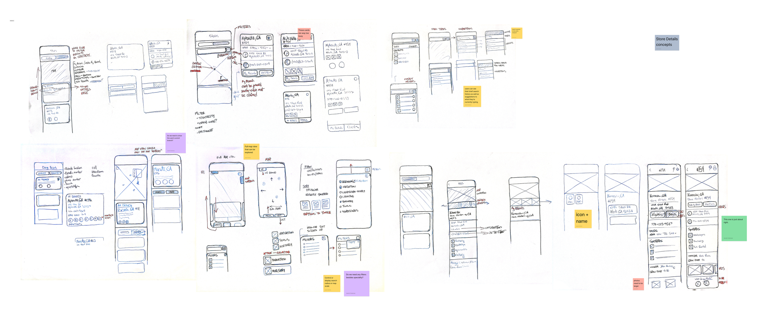
I usually start sketching wireframes for initial brainstorming. It’s the fastest and most natural way to start thinking about layouts and the function of my design.
Often, in between design states, I return to paper to test out a few quick ideas or or variations before prototyping in Figma.


Evolution
At this point, I’m moving from lo-fi to mid-fi wireframes, but I’m often working between quick prototypes, adjusting my user flows, and even sketching out some quick ideas for a new aspect of the project.


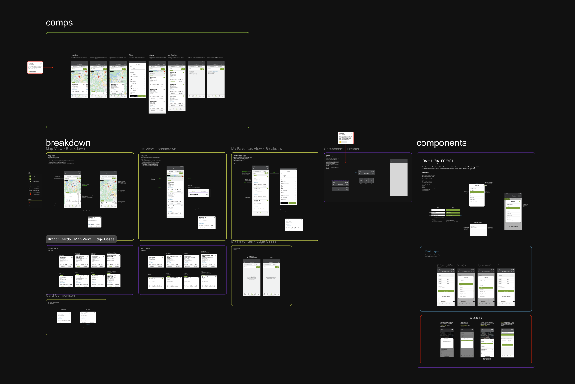
The Final Product


Next Steps
The mobile app branch finder redesign was a huge success and we have continued to improve the experience with further UI enhancements and real-time availability shown alongside the branches when viewing a product’s page.
This project laid the foundation for other Branch Finder improvements on our website, making it easier than ever for customers to connect with the right branch to get the products that they need as quickly as possible.
The next thing that I want to do is provide this level of enhancement to our desktop web Branch Finder.